
The brief
Create a logo for a women's networking event called Epi-Tête, working within Epigram's existing colour palette. The challenge was designing something that felt fresh and appropriate for women's networking while staying true to the established brand colours.

Epi-tête logo
the Creative Process
I took the 'e' from the Epigram logo and repurposed it, creating interlocking circular forms that suggested connection and collaboration – perfect for networking. Used Epigram's green and teal colour palette, then developed the full brand identity. The logo needed to work across different applications, from digital to print materials.
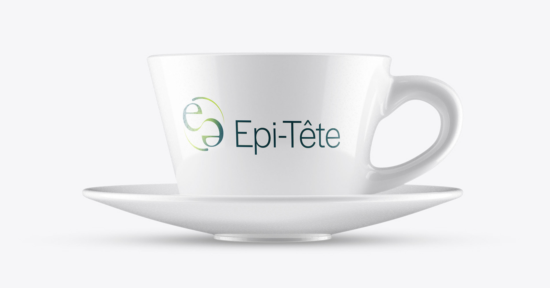
Epi-tête cup

Epi-tête pens
THE Outcome and Impact
The final logo struck the perfect balance – it felt distinctly feminine and networking-focused while respecting the colour constraints. My reimagined 'e' forms communicated connection and community successfully.

The journey to the solution: Alternative versions from the development stage
I always find it interesting seeing the design options that didn’t quite make the final cut when looking at other designers’ work – so I thought it’d be fun to share a few of mine here too.
