
the brief
The client needed an exhibition stand that would actually get people talking and show off their expertise in modern workplace challenges. They wanted to move away from the usual stuffy corporate stands and create something that felt approachable and engaging.

the creative process
I went with silhouettes of people in their brand colours – navy, pink, and burgundy – adding halftone dot patterns to keep things visually interesting. The focus was on key workplace topics like employee incentives, compliance, and happiness, making their complex services feel much more relatable.
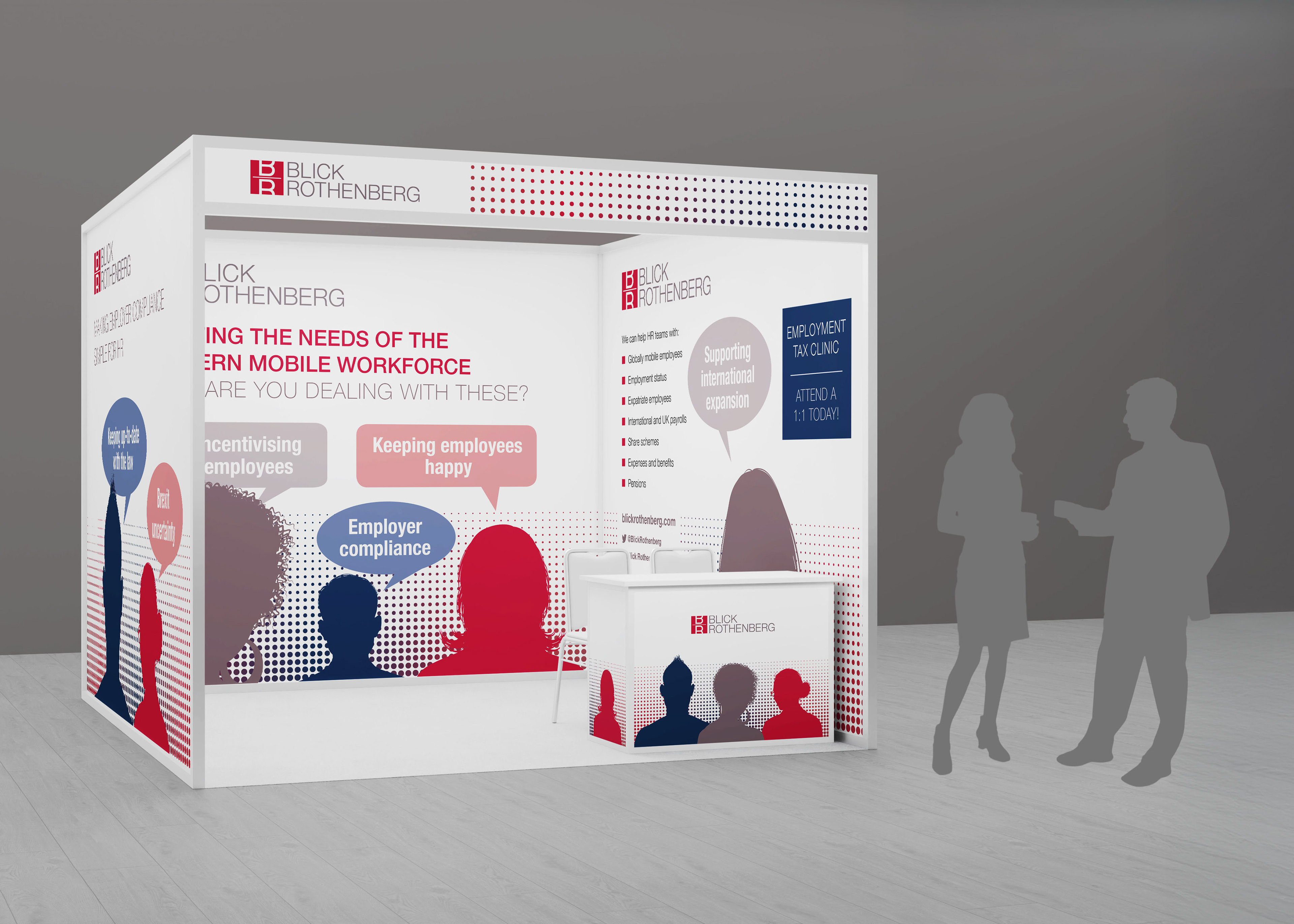
the outcome and impact
The stand worked really well at drawing people in and starting conversations about workplace challenges. The human-focused design made their professional services feel approachable rather than intimidating, helping them connect with potential clients in a busy exhibition space whilst still looking credible and professional.