
The Brief
The client needed eye-catching banners for their book launch event that would grab attention and reflect the inspirational content. The key was making sure they felt like part of the book's world rather than something completely separate.
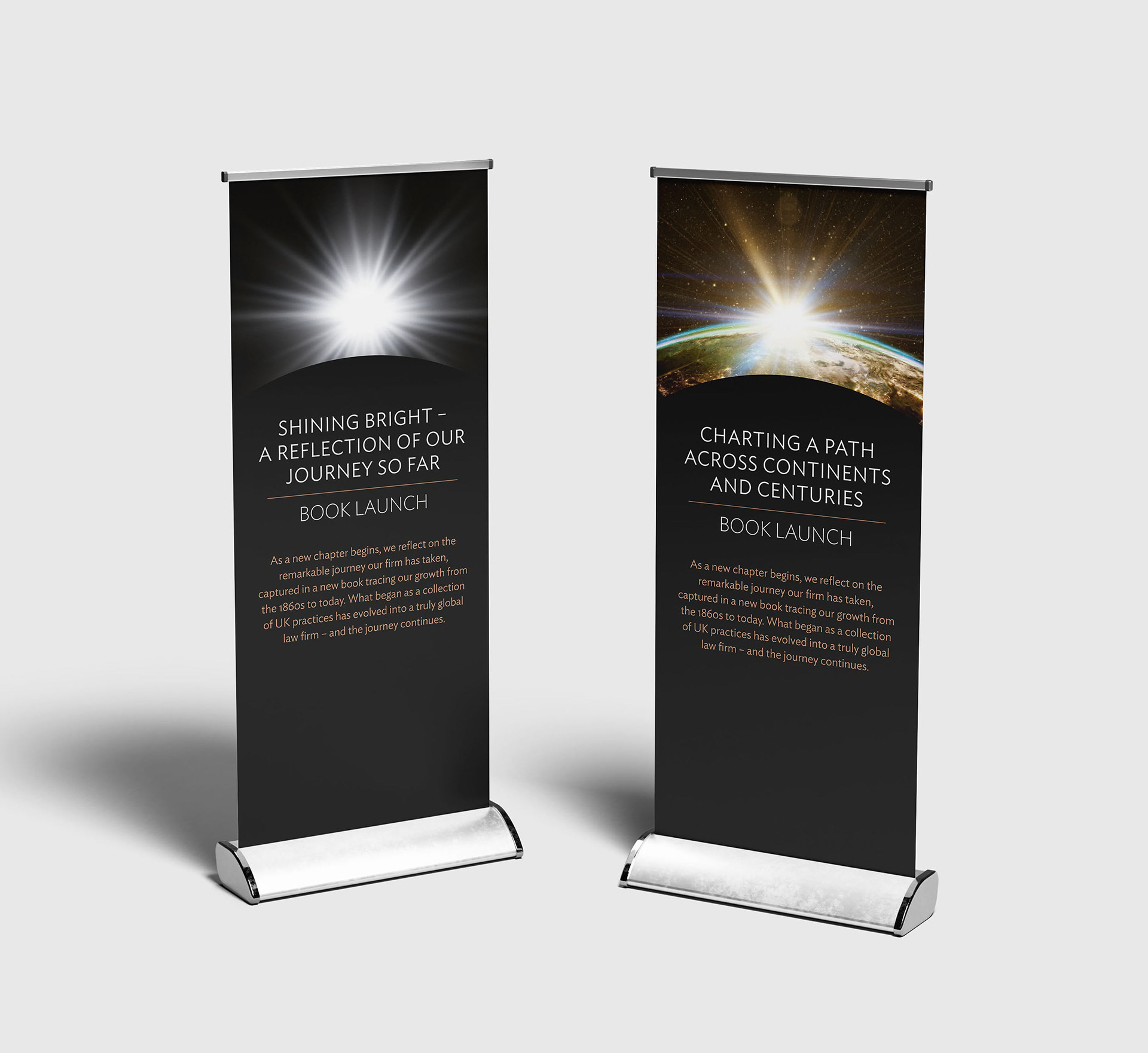
the Creative Process
I kept things consistent by mirroring the book cover and inside page designs, pulling the same colours and typefaces straight from the book. The dramatic light burst imagery reinforces those journey and transformation themes, while the dark backgrounds make sure they'd stand out at the event.
the outcome and impact
The banners worked really well – they felt like a natural extension of the book itself. By sticking to the same design language and colour palette, everything looked cohesive and professional, giving the launch event that polished, unified feel you want.